Problem: Visual brand identity
Learning objectives (LO):
1. Developing visual brand identity
- How to translate a brand identity into a visual brand identity (values, propositions, ...)?
- Important factors and elements in creating brand identity (colors, fonts, ...).
- How to keep your visual brand identity consistent throug time and space?
- How to keep your visual brand identity in different touchpoints?
- Case studies
3. How does the visual brand identity affects the relation with your audience?
Keywords: Brand identity, consistency, values, colors, fonts, goodies, ...
LO1: Developing visual brand identity
1.1 How to translate a brand identity into a visual brand identity (values, propositions, ...)?
- Brand strategy

Source: http://www.rocketmill.co.uk/how-to-write-branding-guidelines-infographic-2


- Designing Brand Identity: An Essential Guide for the Whole Branding Team


1. Conduct research: target group, stakeholders, budget, do's and dont's
2. Clarify strategy: what do we want to say and when => what do we want to reach?
3. Design identity: what do we want that stakeholders think of us?
4. Create touchpoint: how will the stakeholders get to know us (research => where are they)
5. Managing: consistency!
Source: Designing Brand Identity: An Essential Guide for the Whole Branding Team: https://books.google.fi/bookshl=nl&lr=&id=uSNHAAAAQBAJ&oi=fnd&pg=PR8&dq=Designing+Brand+Identity&ots=oOGM3zsyHq&sig=2MI6iI8J95FH9kdbJmN2lfMVWUc&redir_esc=y#v=onepage&q=Designing%20Brand%20Identity&f=false
1.2 Important factors and elements in creating brand identity (colors, fonts, ...)
- How to Build a Brand Bible & Visual Style Guide
- Branding guidelines and rules to maintain the identity consistent
- Brand bible holds together what the public sees from a company => voice and personality of a company => basis for all interactions on behalf of a company
What is a brand bible?
- A document that establishes distinct guidelines on how all aspects of a company’s brand will be handled.
- Rules for creating a unified and identifiable presence for your brand.
- From the design of a logo and how it can be used, to letterhead, the look of a website,personal communications
and how it all looks.
- To help employees properly use and communicate the message of a brand.
- A few key questions: What is the correct spelling and use of the brand (and afflicted) names? What images are associated with the brand and product lines? In what ways can/should the company logo be used? What are people allowed to say about the brand? What marketing tactics are preferred or encouraged versus what marketing tactics should not be used?
- It also serves as a guide for designers. It outlines all of the basic design tools that are needed to create and disseminate company communications: allowable typefaces and styles, color palette, image use, text and tone, and the emotion portrayed by the brand.
Logo usage
Once you have the perfect logo, it is important to maintain the integrity of it across platforms. This includes
how the logo is to be used, from placement to acceptable alterations. Remember, your logo is the simplest
thing people have to identify your brand, make sure you maintain a consistent use of that image.
Fonts and Typography
There should be a defined style for every bit of type used for a brand, for both print and digital applications. Rules
for how to use typography should be clear and distinct, from what typefaces are acceptable, how each is used,
and guidelines for additional styling, size and use of color.
Select a few typefaces that will be used in design projects. This may include one set of rules for print
projects and another for digital applications. But make sure the typefaces have some common links. For
example, many web designers prefer sans serif typefaces for body text whereas you may prefer a serif
style for print. Find a commonality between the two. Consider a headline or “big type” style that you can
use for both types of design projects. Ideally, the brand should include no more than five typefaces and their
usage.
Colors
A defined color palette can be one of the most important aspects of the brand bible. Consider the Golden
Arches and color the represent McDonald’s, for example. Would you as clearly recognize this company if
the giant M was another color?
The brand bible should outline each color and how it should be used. This includes colors that appear only
in a logo to colors that are used for backgrounds, text and other design elements. The numbers of colors in
a palette should be kept to a minimum and can include fully saturated versions and tints.
Further the document should clearly define each color by name and color value for a variety of projects.
Choose primary, secondary and alternate colors for the palette. Define each color with values for print
(CMYK) and digital projects (RGB, HEX). Also note Pantone colors as such with their assigned values.
Images
- Consistency increases awareness and helps cement an emotional connection to a brand.
- Guidelines for images are about more than just whether you will rely on photography or illustrations or other
types of graphics. The brand bible should detail how images will be gathered, edited and used.
Image guidelines should also define when and how certain types of images are used. Will you use
photography or illustrations or both? Is clip art use acceptable? How will images be edited? Will they be
black and white or color? All of these questions should be answered in your image guidelines.
Text and Tone
Finally, you want to make sure the things you say fall in line with the brand image. This applies to everything from the headlines in an ad, to the tone of a press release, to the way blog posts are structured.
Outline the type of acceptable language that will be used. Is the context wordy, or simple and compact? Should the tone be formal, or more conversational? Who is the audience you plan to target? Write for them.
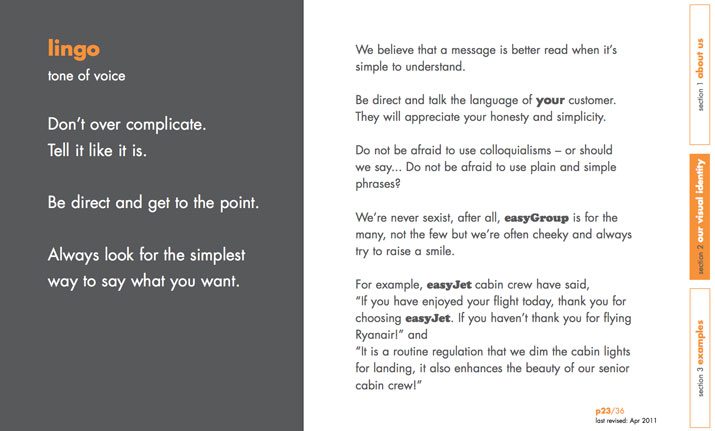
Easy.com defined its brand lingo in simple terms and used a style that mirrors the tone of actual communications. For the brand, simplicity is the key. Skype follows a similar philosophy, going as far to showcase words the company likes and does not like.
Using a consistent and distinct tone can help clients and customers identify with a brand, and creates an association with what the brand stands for. When creating guidelines for text and tone, think about words you want to be connected to – cool, trustworthy, hip, beautiful, efficient, top-notch. Use those as the outline for your rules.
Brand Bible Checklist
Here’s a list things your brand bible should include:
- Overview of brand, including history, vision and personality
- Logo specifications and examples of usage
- Typography palette
- Color palette
- Image use specifications, including photography style
- Letterhead and business card design
- Design layouts and grids for print and web-based projects
- Brochure guidelines
- Specifications for signage and outdoor advertising
- Writing style and voice
- Social media guidelines
- Visual examples to support each rule (provide examples of proper and improper use for clarity)
Source: http://designshack.net/articles/graphics/how-to-build-a-brand-bible-visual-style-guide/
- Other important elements in creating visual brand identity
Taglines
- Short phrase that captures the company's brand essence, personality and positioning
- Distinguishes company from competitors
- Grow out an intensive strategic and creative process
- Shorter life span than a logo
- Ex. Just do it, broadcast yourself => became a part of the populair culture
Essential characteristics:
- Short, unique, easy to remember
- different from competitors
- captures brand essence and positioning
- no negative connotations
- can be protected an trademarked
- evokes an emotional response
A sense of place
- Create a brand experience
- Show your brand identity in your commercial environment
- Materials, colors, space, ... can deliver a customer experience ex. Starbucks vs. Mc Donalds
- Color of the wall, front door, height of the ceiling, big/small, product arrangement, cashier clothes
1.3 How to keep your visual brand identity consistent through time and space?
- Altering Your Brand’s Visual Identity: Is There Ever a Good Time?
The apple with a bite, the golden arches and one and half glasses of milk are all brand signifiers that we can immediately identify without having to utter the name of the company they belong to. A brand’s visual identity (VI) is just the tip of the iceberg, but an important point of recognition for consumers in contact with the brand. Whether a sign off at the end of a tailored experience, or introduction before a conversation has begun, a visual identity is key to brands when developing a relationship with their consumers. Something to nurture and embed within all communications.
Of course, developing an iconic visual identity takes years of work, yet one only has to look at brands like Apple, McDonald’s or Cadbury to see how crucial investment is. But what happens when a brand dares to alter its visual identity? And more importantly when is it, if ever, a good time to make a change?
In order to answer these questions, one needs to begin by asking ‘what makes an iconic brand?’ The answer is simple. An iconic brand is one that defines or even owns its category; it’s the first brand that comes to mind when you think of the sector it belongs to. For example, if anyone asks you to think of soft drinks, there is a considerable chance that a red bottle labeled Coca-Cola immediately springs to mind.
When considering what makes for an ‘iconic’ visual identity, we see that true success lies with those brands that are still easily recognisable when you abolish key elements. Those brands for which the company name is arguably less important than the toolkit used to bring them to life. Icons are built over time and consistent brand experiences, and it is only once this status is reached that a company may look to minimalise a mark or identity system – safe in the knowledge that they have built enough equity and developed strong relationships with loyal consumers. A number of brands have taken this approach and succeeded. The two most obvious examples from recent times are Starbucks and Absolut.
Both are leaders in their respective sectors and both have developed strong signifiers that consumers can instantly identify with, like Starbucks’ white and green siren or Absolut’s iconic bottle shape. Both can easily be recognized even when you remove key elements such as the name of the company or description of the product, and, rather interestingly, both brands removed exactly that when simplifying their VI.
Starbucks dropped their brand name and the word ‘coffee’ from its logo, and Absolut removed the words ‘Country of Sweden’ and ‘Vodka’ from its bottle. Removing a word mark to leave only the logo requires broad brand awareness if you’re to ensure that you don’t confuse or lose customers. When we look at Starbucks and Absolut, both were clever in keeping many of their iconic signifiers, and the result was a solid, refreshed VI, which did not infringe upon the customer’s experience of the brand.
This brings us squarely onto the risks when altering your VI – the biggest and most obvious being the loss of customer loyalty. This is the key reason many brands fear making the change or don’t quite understand when to make it. It’s important to remember that when people become brand loyal, they are not only loyal to the product but also its aesthetics. The danger of rebranding is that customers can be too attached to the old concept to accept the changes.
In 2009, Tropicana (owned by PepsiCo) learned a rather harsh lesson about consumers’ connections with their packaging. Earlier that year, the company made some drastic changes to the visual identity of their flagship product by replacing the image of an orange pierced with a straw to a picture of a glass of orange juice. They also implemented a vertical logo with a new typeface. The result was hundreds of customer emails, letters and telephone calls all complaining about the changes. Essentially, consumers found the product difficult to distinguish among the varieties of Tropicana, as well as differentiating it from other juice brands. It was reported that sales of the Pure Premium line dropped by a massive 20 per cent between January 1st and February 22nd. Certainly not the result PepsiCo was aiming for.
What PepsiCo hadn’t acknowledged is that customers appreciated the classic pre -2009 design. Familiarity breeds trust in a product, and reliability is of particular value during a time of constant change and development. Tropicana didn’t take this into account at first, but their reaction to customer out-cry saw the brand revert back to the old packaging by the end of 2009, proving that they were listening. This is a good example of an iconic brand misjudging when a VI might be altered and, more importantly, to what extent. A VI overhaul has the power to be disruptive, and not necessarily in a good way; in these instances, the old adage ‘if it ain’t broke don’t fix it,’ rings true.
That’s not to say iconic brands cannot alter their VI. Shell, itv, Channel 5, HSBC and, of course, Absolut and Starbucks are all perfect examples of brands refreshing their visual identities to successfully contemporise their communications. The reason for their success comes down to keeping the customer front-of-mind. These companies acknowledge that a brand’s identity goes way beyond a logo – it’s about the experiences they offer. These experiences and brand signifiers weren’t altered to the point of being unidentifiable, thus making the transition for customers more seamless.
Source: http://www.brandingmagazine.com/2014/02/17/altering-your-brands-visual-identity/
- Digital marketing for a global audience
The world’s a big place, but it’s made significantly smaller with digital technology and social media so it’s no wonder brands are finding it easier to reach new audiences overseas.
We only have to look at Coca Cola and Walkers crisps to see the potential success of going global when done properly.
An international success of our own is taking fastjet from start-up to household name in three countries across Africa over the past 18 months, with more new country launches in the pipeline. We’ve learnt a lot along the way about how to penetrate new markets, from the importance of understanding cultural differences and buying drivers to the impact that social and technological infrastructure can have on how people consume media and engage with brands.
If your business has mastered the UK market and you’re thinking about going overseas, take note of our Top 5 considerations before you jump in head first.
1. Understand your market
Customers differ from country to country – your integrated social campaign that generated a 25% increase in web traffic and conversions here in the UK may fall flat on its face somewhere else. While at home your brand positioning and tone of voice might be bang on in engaging your audience, in another country it could potentially offend or get lost in translation.
Conduct thorough market research into the customs, cultural preferences and reference points of your intended customer-base. What TV programmes do people watch? Do they like art, music and fashion? What do they do in their spare time? Who are the key influencers? How do they engage with social media? Do people shop online or mostly offline in store? What devices do they use?
For example, 32% of fastjet customers in South Africa and Tanzania access the internet via their mobiles, with smartphone ownership outnumbering computers and tablets. The most popular devices are the more basic models so we have to optimise content for these platforms, bearing in mind apps, image and page load times, website navigation and much more.
We use the this checklist as a framework for our research and to get to know customers’ buying drivers and habits.
2. Brand and competition assessment
Carry out a full assessment on your brand logo, visuals, colours etc. Will it make sense to overseas markets, and does it have any connotations other than what you intend?
Do you need to consider any other languages?
Whilst ideally you don’t want to change your logo or brand name, you might consider having a different slogan for different countries to better engage customers (the content of which can be driven from your market research into cultural trends and buying drivers).

Suss out the competition
Don’t assume that your competitors overseas are the same as here in the UK. It’s just as important to understand your new competitive market as it is to get clued up on your new customer-base so you can position your brand properly within the mix.
What are other companies doing and are they doing well? Do they have a strong social presence and what is their digital / content strategy? What are their offline marketing efforts and how successful are they? Are they working with key influencers and are there publishing opportunities for you to exploit here down the line?
Use the insight gained from your competitor analysis to inform your launch strategy and beyond, gaining where others have failed, and avoiding mistakes already made.
3. Technology
Understanding the technological infrastructure is crucial to your success. There’s no point building an all-singing-all-dancing HTML 5 website if your core audience accesses the internet on mid-range smartphones with limited technical capabilities.
Use the checklist above to conduct research into internet and computer access, social media platforms and devices used to access them. Do people make purchases online and how do they pay?
For example, fastjet’s customers predominantly use their mobiles to search for and book flights, but are able to pay later (within a certain time period) via cash or credit card at one of the offices or online. This makes it as easy as possible for customers to purchase their flights with the technological infrastructure and cultural preferences in mind.
4. Sort your strategy
Once you’ve completed your market research and audit you’ll need to pull together your multi-channel marketing strategy from the insight gained. Write a concrete launch plan and activity calendar, integrating any key dates or cultural events where possible to maximise coverage.
Remember the five fundamental elements of digital marketing when writing your online strategy – and optimise your website accordingly to make it search engine friendly. Make sure your website has a healthy backlink profile with good, well-structured and formatted content, and ensure it’s optimised for mobile platforms – don’t make your brand inaccessible to the millions of mobile web users every day.
Once your website structure, content and responsive design is sorted, write yourself a winning social media strategy to generate brand awareness and exploit the highly targeted advertising opportunities available to increase reach and engagement.
As part of an interesting and consistent multi-platform social media content strategy you’ll need to consider paid advertising through Facebook ads or Twitter Promoted Tweets/Trends to boost exposure and grow followings. An integrated email marketing campaign and blog content strategy will also tie everything together and maximise your digital presence.
Read our blogs on digital marketing and social media strategy for tips on how to do this.
5. Monitor and adapt
Just as you would do at home, make sure you closely monitor the brand reception and sentiment, as well as campaign success and conversions. Is your campaign working? If not, change it.
Hopefully you will have decided on the metrics to measure success when you first set out your goals and KPIs, and set up listening and scheduling tools to keep notified of any brand mentions or conversations you should be getting involved in.
Stay up to date with news, events and cultural trends in the country you’ve launched your brand in, and where possible integrate your own campaign activity into these dates to keep your audience interested and engaged, and your brand relevant.
Getting the above elements right could be the difference between boom and bust, so it’s important to get the research and strategy nailed from the outset.
Source: https://www.bozboz.co.uk/blog/digital-marketing-global-audience-top-5
- Article google
Interesting article about how google changed it's logo
2.1 How to keep your visual brand identity in different touchpoints?
- Keep Your Brand Identity Across Customer Touchpoints
As a multichannel marketer, you touch your customers in many ways. In a given year, they’ll see your catalog, e-mails, postcards, package inserts, Web site and even store displays. Across these varied media, what should stay the same? What should be different?
Lois Boyle, president of Mission, Kan.-based catalog consultancy J. Schmid& Associates, offers the following three tips on maintaining brand identity across multiple customer touchpoints.
1. Vary your message, not your voice. Customers will get used to the way you speak to them, notes Boyle. If the same person isn’t responsible for writing copy for every customer touchpoint, keep samples of your copy voice on handfor easy retrieval, says Boyle. The message, however, should change with the goal of the piece. Reaching out to new prospects? Tell them what’s unique about your brand, she notes. Reactivating old customers? Let them know you miss them by saying so and offering a promotion, she notes.
2. Keep the look consistent. “Design elements need to be the same from effort to effort,” say Boyle. Maintaining the same color palette, use of company logo and slogan, and product presentation will help your customers recognize you, she notes. Which of those elements takes focus will depend on the type of effort. “A direct mail piece is very offer- and copy-driven, as opposed to a catalog, which is very visually driven,” Boyle points out.
3. Establish the role of a brand zealot. This person would see each piece before it reaches customers and judge if it’s representative of the brand.”Smaller companies do this well, because there’s just one person in charge of everything from catalog mailings to e-mail campaigns. The larger the company, the harder it is to monitor,” says Boyle. Whether it’s a single individual or small committee, a brand zealot should be in charge of maintaining that image, she notes.
Source: http://www.mytotalretail.com/article/creative-part-1-keep-your-brand-identity-across-customer-touchpoints-50698/
- Customer experience planning

Source: http://www.peopledesign.com/brand-touchpoints
- Mc Donalds
Interesting case studie about Mc Donalds, they show that theall their burgers and products are so recognizable that they don't even need a prominent logo.
Source: http://www.tmndesign.com/sharings/beyond-the-logo/
- Steep this
Very interesting article about how a brand is designed from the beginning to the end.
LO3: How does the visual brand identity affects the relation with your audience?
- Whether you’re knowingly influencing it or not, your audience is defining your brand. If the visual that you’re conveying does not match your values, it will disappoint, confuse, and alienate your audience
Define your audience
- Who should want to be friends with your brand?
- Get specific with these questions: Age, Gender, Location, Income, Marital Status, Occupation, Education Level. Depending on your product or service, it may be helpful to define ethnicity. For example, if you sell chemical hair relaxers, it’s important to target your ethnicity.
Put a human face on your brand
The Color Run shows that it’s an upbeat event with the colorful choices. It’s hard to look at this site without feeling energized.

Conversely, Land Rover shows us that the brand rugged and serious, maybe a little gentlemanly.

You can tell that these sites offer two different personalities. One site is playful and the other is more serious. How do you know? Imagery choices, photo filters, and color schemes.
Consider how you can play up the images on your site to bring out the key points of your personality.
Use emotion
- Does your brand tell a story that will move your customers in some way?
- P90X knows how to stir emotion in their customers. Targeting couch potatoes, P90X shows you what’s possible if you get off the couch and start doing pull ups. Within 90 days, you’re transformed into a fat-burning, muscle bursting machine. Are you pumped? Are you ready to put down the potato chips and make life happen instead of watching it go by!? You can do it! (That’s the emotion behind the P90X brand.)

Once you have a narrative, tell it over and over again. The way to get recognized as a brand leader is crafting the perfect story and then telling it again and again to anyone who will listen.
Keep it simple
- Your visual identity does not need to be complicated. When you have too many things going on, you run the risk of confusing your audience. At the risk of seeming underwhelming or unexciting, remove everything from your visual identity that does not contribute to your brand persona.
Keep it consistent
Customers like it when they recognize something.
Jeweler Laura Bezant offers a distinct visual style on her brand website.

When I visit Laura Bezant’s Instagram, I get images in a similar tone.

Sun-washed images with all the same color story.
Consistency lies in applying the same filter, the same size, the same font type across your visual platforms. It creates cohesion, so that if a customer follows you on Facebook instead of Instagram, they still get the same story.
When you’re on social media, you should be fluent in the conversation. For visual branding, it’s key to find the appropriate content for your audience on each platform. For example, Pinterest appeals to advice, DIY, and helpful tips and tricks. The images you post on Pinterest should be in someway actionable by your audience. You want them to pin it for increased exposure, but you also want them to click through to your site.
Facebook and Google+ is all about community. You should use these platforms to start conversations with your audience, and gage interests to further develop your brand.
On Twitter, short bursts of commentary, shameless self-promotion, and catchy imagery is the language. Instagram is suited to slices of life.
Social media
Use the opportunity on social media to become human to your friends, followers, and customers. It’s important to use every square inch of real estate to perfect your persona.
Logo
You are not your logo. Although a logo is great to have, it has no intrinsic meaning by itself. Eventually, as you develop your brand identity, your audience will come to associate your brand with your logo, and transfer all of their perceptions about you onto your logo.
Now, that doesn’t mean you should not worry about your logo. But, strive to keep it simple, and let the colors agree with your core branding message.
Colors
Colors are everything when it comes to visual branding. There’s a psychological attachment to each color. Observe:

A blue color scheme says that you can be trusted. Many banks use blue to convey this message, including Barclays, Chase, and Citibank. Purple is often associated with creativity and luxury. You should use this color if you’re slightly on the fringes or a true original. Red is passionate and bold. Along with sister colors orange and yellow, red grabs attention. Green is eco-friendly and fresh. It symbolizes growth. It’s a no-brainer for natural products to use this color. Black is great for authoritative sites. It’s also a sophisticated color that works well with established brands.
Interaction?
- The beauty of social media is that you can interact with your audience. Don’t let that go to waste. Run photo contests on Instagram or create a group board on Pinterest and invite followers to contribute to a specific team. Use these visual clues to understand what are your audience is interested in.
- In your visual branding, you need to show off how accessible you are. Your audience needs to feel connected to you. The best way to be relatable is to be transparent. The more honest and raw you are, the more authentic you become, and the easier it is for people to identify with you.